Emergency Department Application
Problem
Communication and efficiency in Emergency Departments are a life and death matter. Bottlenecks increase wait times for patients, this causes an increase in the hospital's "left without being seen" metric.
Key Consideration
Improve workflow for clearing up bottlenecks.
Give analytic insight to key metrics.
Create a solution that would integrate with current EMR software.
Background
The team was challenged to research and create a prototype for Emergency Departments. Through extensive industry research, we identified key issues that ED face including bottlenecks, long wait times, communication, and predicting ED surges.
Users
We identified multiple users that would need to interface with the solution including the following.
Unit Secretary
Doctors
Nurses
Administrators
Lab Technicians
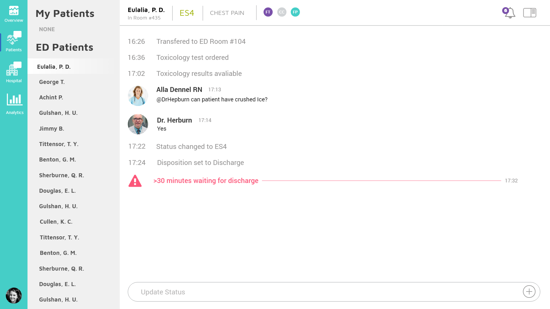
For Doctors and Nurses, we discovered through user interviews that they needed the application to fit within their existing workflow as they don't have time to add anything else to their workload. This is why we leveraged a UI pattern made famous by Slack letting Doctors and Nurses communicate relevant information quickly saving valuable minutes in the ED.
Administrators are focused on the larger picture of how the ED is flowing. We provided a way for them to see the health of the ED quickly and help them identify bottlenecks.
My Contributions
Researched the needs of a modern ER by conducting interviews
Researched the industry to understand what needs might be met with a new approach to ER communication
Designed high-fidelity UX prototype
Created custom data visualizations unique to the needs of the ER


